
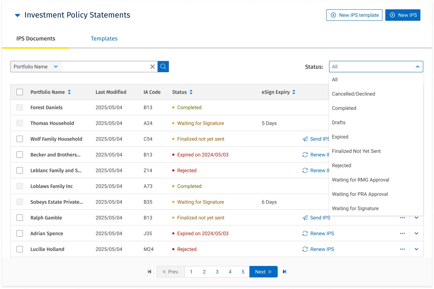
From Status Soup to Actionable Clarity
Before diving into how I got here, this is where we landed. The redesigned IPS dashboard replaced cognitive overload with immediate clarity every status is actionable, critical details are visible at a glance, and advisors can manage their entire IPS portfolio without leaving the screen.


1. Introduce new status (Approved by RMG) so that there is a differentiation of when an IPS has been approved by RMG, and when an IPS has been sent for signing.
2. Signing order of IC and Client to be combined into a single step as documents are sent to both IA/IC and Clients at the same time.
What Changed
Collapsed redundant statuses into clear, actionable buckets (Waiting for Approval, Waiting for Signature, Expired, Rejected)
Surfaced expiry dates, household names, and document IDs directly in the dashboard eliminating the "information black holes" that forced manual tracking
Added inline actions (Send IPS, Renew IPS) so advisors could act immediately instead of navigating through multiple screens
Introduced eSign expiry countdown so advisors could proactively manage deadlines
The Buffer State: The Highest Impact Design Decision
The original system coupled document finalization with client sending, one irreversible click. A mistake in a legally mandated document meant hours of rework.
I introduced a Buffer State: a verification step between locking the document and sending it to clients. After finalizing, advisors now see a confirmation:
"IPS Finalized. Would you like to send the finalized IPS to all recipients for approvals?"
with two clear options
"Do not send" and "Prepare to send."
This single architectural change gave advisors the control they needed while maintaining full compliance integrity.


Uncovering Systemic Failure: A "Rainbow of Frustration"
To move beyond anecdotes and prove the problem was universal, I led a cross-Canada discovery phase. Synthesizing feedback from 15 advisors across five regions through in-depth interviews and contextual observation.

The Affinity Map: Proof of Pattern (FigJam)
Each colour on the map represented a different advisor, yet their frustrations clustered identically around three core themes:
Status Soup: Inconsistent, overlapping status labels made it impossible to gauge an IPS's true state.
Information Black Holes: Critical details such as expiry dates, document IDs, household names were buried or invisible, forcing manual tracking.
Rigid, Punishing Workflows: The inability to correct minor errors without recreating a document from scratch was the single biggest source of frustration and compliance risk.
This wasn't a handful of dissatisfied users. The "rainbow of frustration" provided undeniable evidence of identical systemic failures impacting advisors everywhere.
The Journey Map: Pinpointing Where the System Broke
Mapping the end-to-end advisor journey exposed the exact moments where the system created maximum friction:
At Generation: Anxiety around the irreversible "generate" step. Advisors knew that any client-requested change would require hours of rework so they delayed, double-checked obsessively, and still made errors under pressure.
During Tracking: Constant context-switching and manual tracking to answer a basic client question: "Where is my IPS?" The system offered no single view of a document's status.
At Expiry: A reactive scramble to renew documents, because the system provided no proactive visibility into upcoming expirations. Advisors relied on personal spreadsheets and manual calendar reminders.
These three moments became the foundation of my design strategy. Every solution I shipped mapped directly back to one of these pain points.

Shipping Momentum: Quick Wins That Earned the Right to Rebuild
Before I could tackle the architectural problems, I needed to build trust with advisors, with stakeholders, and with the engineering team. I identified and championed a series of targeted, high-impact fixes that delivered disproportionate relief relative to development effort.
This wasn't just about shipping fast. It was a deliberate strategy: these quick wins generated the user goodwill and stakeholder buy-in I needed to pursue the larger platform transformation.
Shipped: Batch Delete
The Problem: Advisors wasted significant time deleting IPS drafts one by one, a frequent but tedious daily task.
The Solution: A multi-select batch delete feature with a clear confirmation modal.
The Impact: Eliminated a daily friction point, saving collective hours of manual effort and proving our team's ability to deliver tangible value quickly.

(L) Allow deletion of additional IPS status types. IPSs that cannot be deleted: Completed, Waiting for (any) signature, Migrated
(R) Enable batch delete
Validated & Prioritized: Custom Notification Alerts
I identified a strong user need for customizable email notifications allowing advisors to configure when and how they receive alerts about IPS status changes and upcoming expirations. This was validated with users, documented, and added to the backlog as a high priority follow-up.

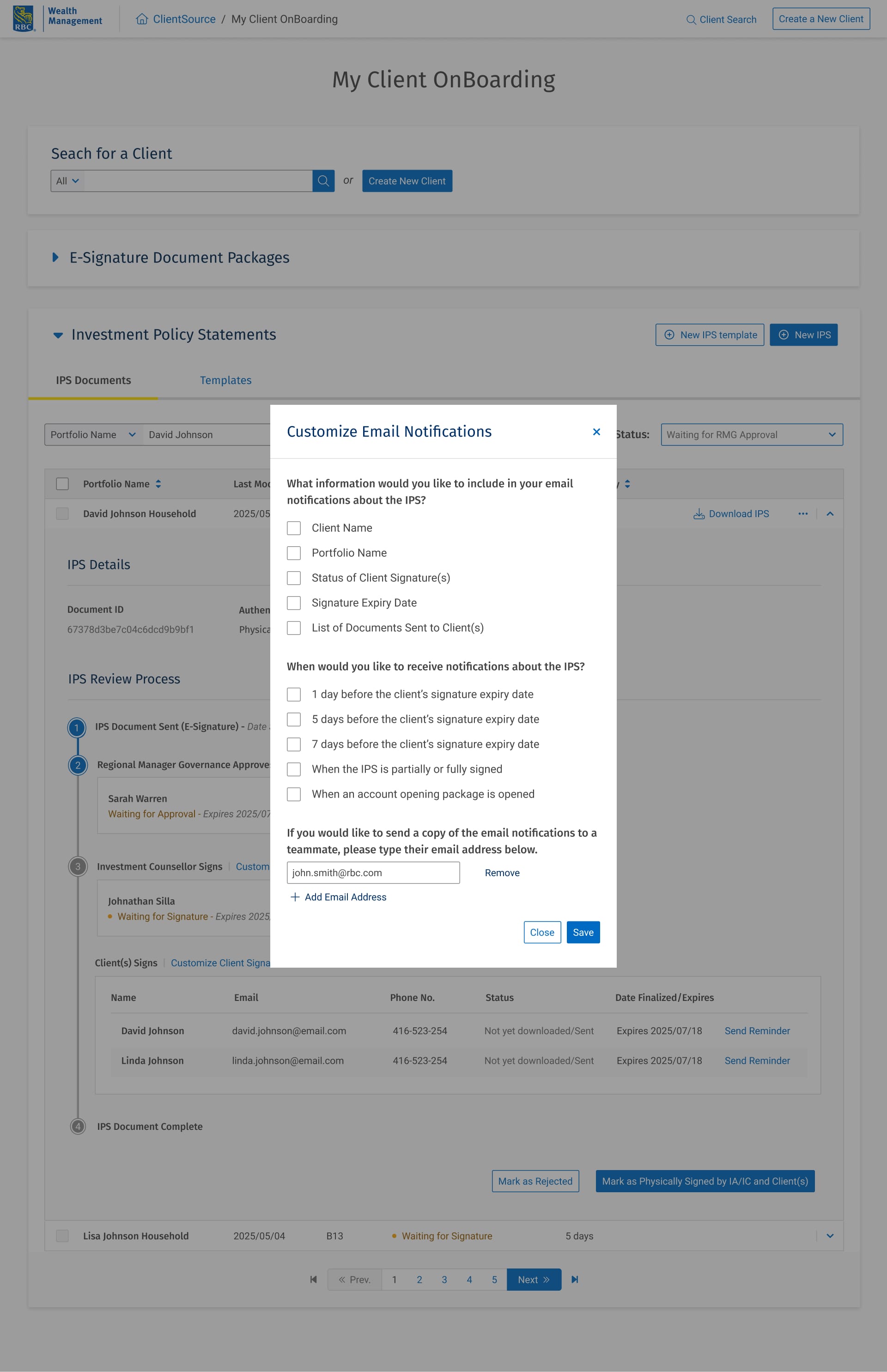
(L) Customize IC signature notifications CTA; (R) display modal with custom settings
De-risking the Overhaul: Building Shared Language with Engineering
The status overhaul was the linchpin of the redesign but it created a standoff with engineering. The dev team saw the status simplification as scope creep that would require significant backend refactoring. I saw it as the root cause of every advisor complaint.
Rather than arguing from the design side alone, I mapped what I called a Logic Matrix. A comprehensive document showing every existing status, every possible action per status per user role, and how the proposed leaner status model would map to cleaner API responses.

What the Logic Matrix Proved (FigJam)
The Matrix made three things visible to engineering:
The current system had overlapping statuses that required redundant error handling and edge case logic
The proposed model collapsed these into fewer, cleaner states actually reducing backend maintenance
Fewer statuses meant fewer error reporting triggers and simpler QA coverage
Once the engineering team saw the Logic Matrix, the conversation shifted from "this is more work for us" to "this actually simplifies our codebase." The standoff resolved not through persuasion, but through shared evidence.
This artifact became the single source of truth for the rest of the project. Design, engineering, and product all referenced it during implementation.
Architecting for Flexibility: Solving Foundational Flaws
The advisor frustrations I uncovered weren't just UI problems they were baked into the product's core architecture. The system's rigidity, tying document finalization directly to sending and offering no path for renewal, forced advisors into inefficient and risky workarounds.
The "Renew" Function:
The Problem: An expired IPS required complete, manual recreation from scratch even though the document was typically 99% identical to the previous version. This was the single biggest source of wasted time.
The Solution: A "Renew" action that reactivates an expired IPS, resetting its status to "Finalized not yet sent" and preserving all existing content.
The Impact: Turned a multi-step, error-prone task into a single click. Eliminated hours of repetitive rework for advisors managing large client books.

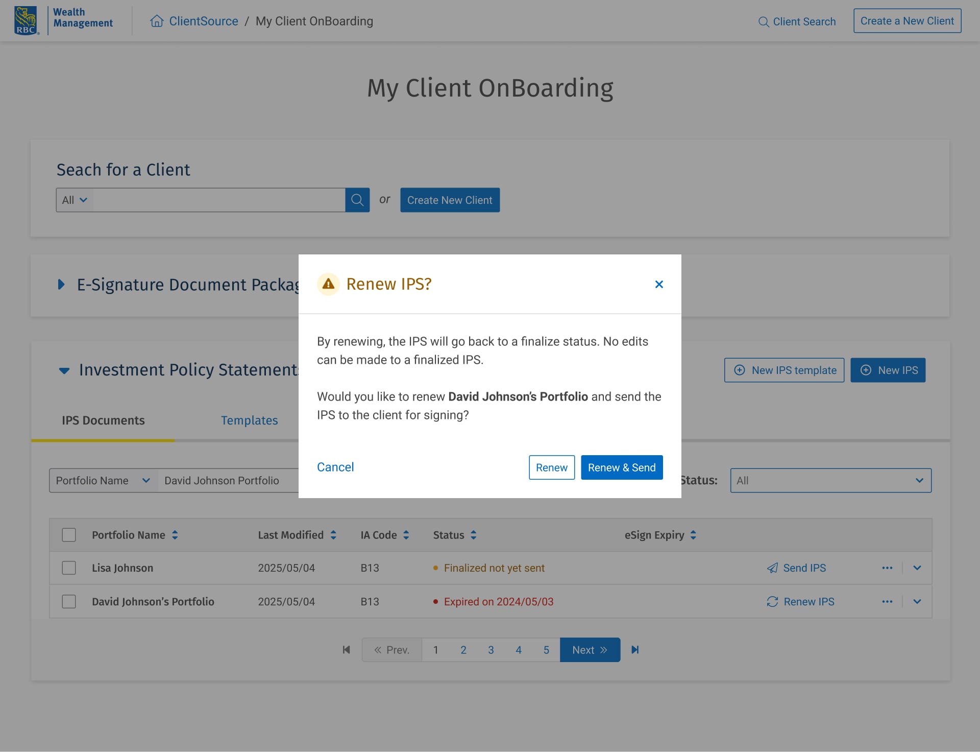
Instead of rebuilding, advisors could simply ‘renew’ an expired IPS.
Decoupling Finalization from Sending:
The Problem: The original system's irreversible "Finalize & Send" action created constant anxiety. Advisors couldn't prepare documents in advance or verify content before it reached clients.
The Solution: I decoupled these into two distinct steps. Advisors can now Finalize a document (locking its content) without triggering any client communication. Sending became a separate, explicit action.
The Impact: Reduced cognitive load and error risk by creating a clear, two-step process. Advisors gained control over their workflow, they could prepare documents on their own schedule and verify before sending.
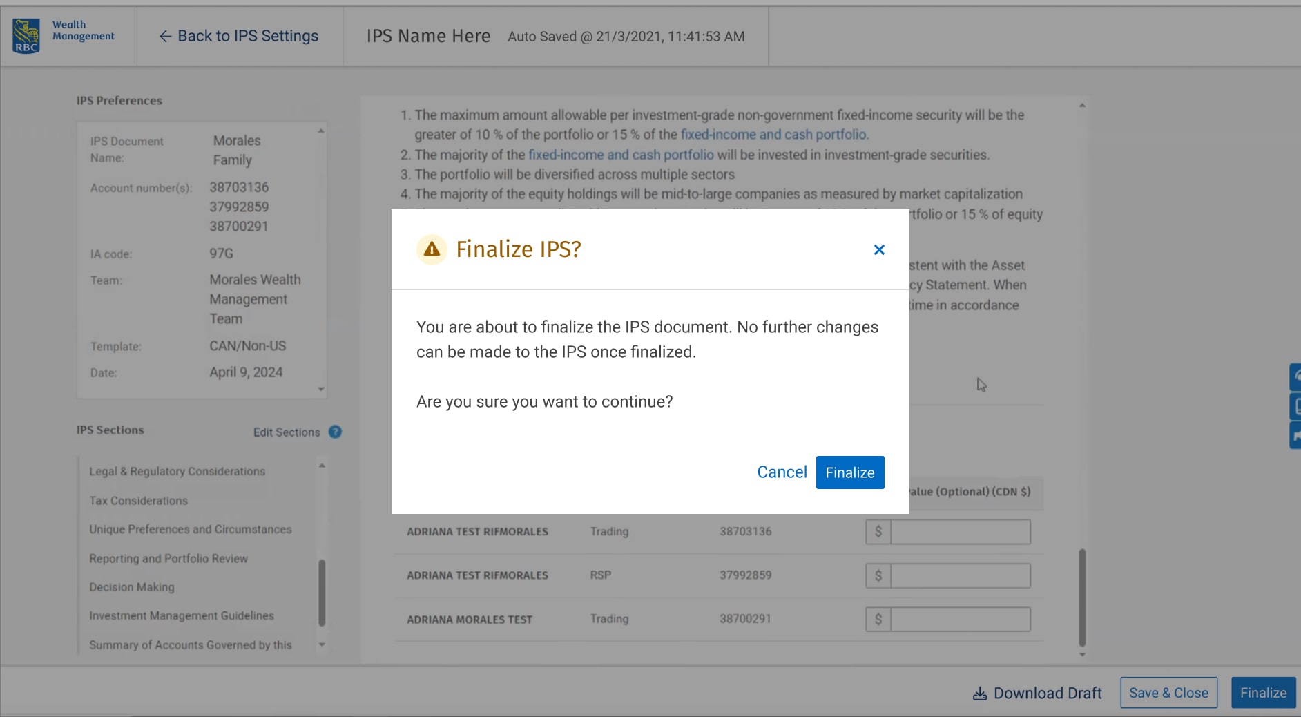
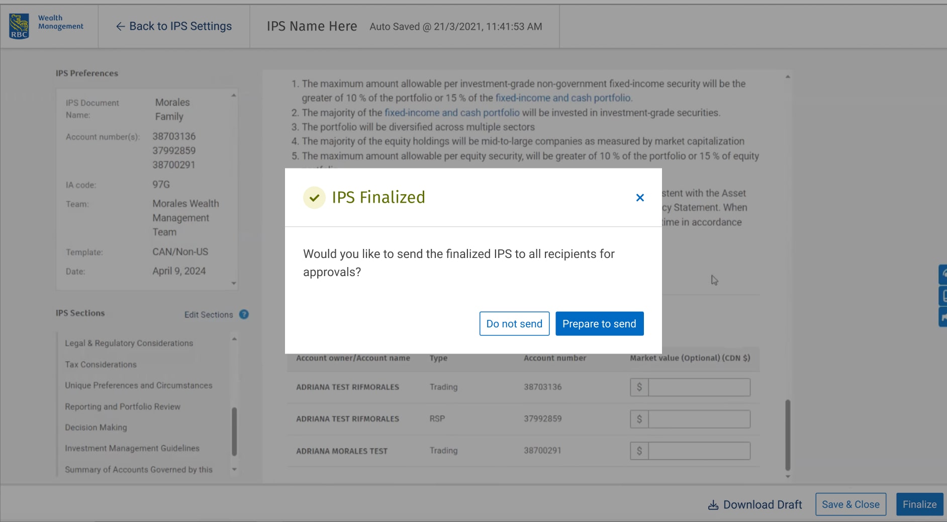
Prep documents without accidentally triggering client emails; Finalize and Send split into distinct steps for clarity.
Simplified Status Architecture
The Problem: The original status list was bloated with overlapping, confusing labels that made it impossible for advisors to quickly assess where a document stood.
The Solution: Collapsed redundant statuses into clear, mutually exclusive states. Introduced a new "Approved by RMG" status to differentiate between approval and signing stages. Combined the separate IC and Client signing steps into a single stage, reflecting how the process actually works.
Simplified status list. Removed and combined similar statuses together for more cohesiveness.
Defining the North Star: From Document Creation to Knowledge Reuse
Solving today's pain points was the first step. To create lasting, compounding value, I defined a north star vision focused on scaling advisor efficiency and institutionalizing expertise.
IPS Templates: Institutionalizing Knowledge
The Vision: Move from one-off document creation to a knowledge reuse model. Senior advisors can create, duplicate, and apply standardized templates for common portfolio types (retirement, aggressive growth, conservative income).
The Impact: Saves hours of repetitive setup per advisor per week, ensures consistency and compliance across teams, and allows best practices to be shared and standardized across the organization.
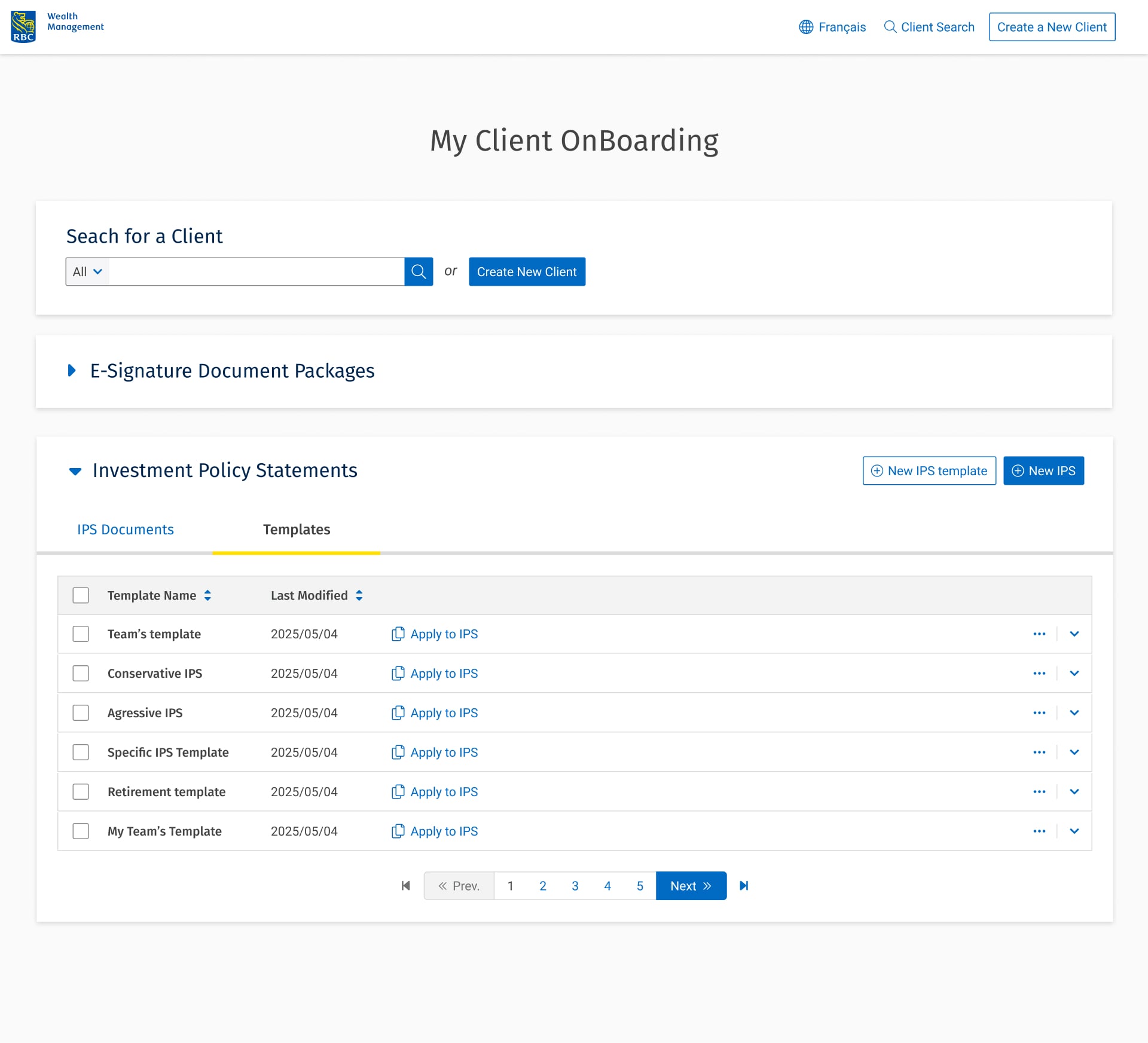
Reusable IPS templates to save hours of repetitive setup.
Scalable Foundations
The Vision: Design system foundations that scale gracefully with increasing complexity, refined search with pagination for large datasets, cleaner account linking for complex households, and robust filtering for advisors managing hundreds of client portfolios.
The Impact: Prevents new friction points from emerging as advisor usage grows, and creates infrastructure that future features can build on.
Refined flow shaped by advisors input.
Search redesigned with pagination and multiple contact fields.
Cleaner flows for linking accounts and assigning roles.
Inline Guidance & Best Practices
The Vision: Embed expertise directly into the product. Contextual tooltips and guidance within the IPS draft reduce the cognitive load and "blank page anxiety" for newer advisors.
The Impact: Accelerates onboarding, reduces errors, and helps maintain a high standard of advice without constant supervision from senior team members.


Inline guidance to reduce blank page stress.
Measurable Impact
Business Translation
Across the advisor base, these efficiency gains translated to approximately $400K in annual operational savings in the first year.
The Outcome That Matters Most
Beyond the numbers: advisors started trusting the tool. Before the redesign, they were working around the system relying on personal spreadsheets, manual email reminders, and workarounds. After, they were working with it. That behavioral shift was the real indicator that we solved the right problem.
Shipped and Sequenced
What Shipped
Redesigned IPS dashboard with actionable statuses and surfaced critical details
Batch delete functionality
Expanded IPS details view (Document ID, signature type, AO package links)
Expiry date visibility in dashboard
Household portfolio naming
Simplified status architecture
Designed, Validated, and Queued
Decoupling finalization from sending (Buffer State)
Renew expired IPS function
Customizable email notifications
IPS templates and best practices guidance
Inline contextual guidance for new advisors
These architectural features are validated with users, fully documented, and designed to be implemented independently reducing dependency risk for engineering. The quick wins shipped first to build trust and demonstrate value; the architectural changes are sequenced for the next development cycle.
What This Project Taught Me
This project reinforced a principle I now apply to every enterprise design challenge: you have to earn the right to rebuild.
The instinct as a designer is to go straight for the architectural overhaul: fix the root cause, redesign the system. But in a compliance heavy, high-stakes environment like wealth management, trust is the prerequisite for transformation. The quick wins I shipped first weren't a compromise they were the strategy. They proved to advisors that someone was listening, proved to stakeholders that design could deliver measurable value, and proved to engineering that I understood their constraints.
The Logic Matrix was a turning point for me personally. It taught me that cross-functional alignment isn't about presenting your solution convincingly it's about making the evidence visible so everyone arrives at the same conclusion. That approach has become foundational to how I work.
Enterprise UX is never about the perfect process or the clean case study. It's about removing friction systematically, building trust deliberately, and designing systems that are flexible enough to evolve because in regulated environments, the requirements will always change.