Architecting a Household Centric eSign Framework for RBC Wealth Management
Outcome
De-risked a core business workflow by delivering a validated, future-proof design that reduces manual processing time by 40% and establishes a scalable model for complex financial onboarding.
Role
Lead Product Designer | Owned strategy and execution—from hypothesis formulation and UX architecture to usability testing and stakeholder alignment.
The Systemic Breakdown in RBC's Onboarding
RBC Wealth Management's competitive advantage is its personalized service for high-net-worth individuals and complex households.

However, its core Client Onboarding (COB) application was undermining this value.

The process was fragmented across multiple systems, forcing associates to manage a chaotic back-and-forth of emails and documents for a single household. This wasn't just an inconvenience; it created tangible business risk:
  • Operational Drag: Associates spent hours each week on manual follow-up and error correction.

  • Compliance Exposure: The lack of a unified system led to a high rate of missing signatures and document errors, delaying account activation.

  • Client Relationship Risk: The inefficient and opaque process frustrated both associates and their clients, straining trust from the outset.

The core insight was that the tool was built for individual accounts, but wealth is managed in households. This architectural misalignment was the root of all friction.
Strategic Approach: Framing the Bet
Analyzing the Existing Workflow
Analysis of the as-is workflow and stakeholder interviews confirmed the onboarding process was fundamentally broken.

The core issue was architectural: advisors were forced to manage households—complex financial entities with multiple signers—through tools designed for individual accounts.

This misalignment created a cascade of problems: associates wasted hours on manual follow-up, the error rate for missing signatures was unacceptably high, and the client's first experience with RBC was fraught with delays and frustration.
Faced with time constraints that precluded traditional upfront research, I advocated for a hypothesis-driven approach.

We would treat our core assumptions about user needs as testable bets, using rapid prototyping and usability testing to validate or refute them with speed and rigor.
My Strategy: Hypothesis-Driven Rigor in lieu of Traditional Research
Defining Assumptions and Hypothesis
Faced with time constraints, I championed a method that replaced upfront ethnographic research with rapid, testable assumption validation.

This wasn’t a compromise; it was a strategic choice to maintain velocity without sacrificing user-centricity.

I synthesized insights from support ticket analysis, prior user feedback, and domain expertise to form our foundational hypotheses.
Our Core Bet
We believe that by designing a single, linear workflow that treats the entire household as the primary unit, we can reduce manual processing time by 30% and eliminate signature errors.
Architecting the Solution: Key Decisions & Trade-offs

The core challenge was architectural, not aesthetic.

Success depended on designing a new information and workflow architecture that could handle the complexity of financial households.

1. Decision: The Household as the Primary Entity
I advocated for a fundamental shift in the product's mental model from "account-focused" to "household-focused."

This required aligning product and engineering on a new data paradigm but was essential to future-proof the design for complex client structures and eliminate the root cause of the fragmentation.
2. Trade-off: Constrained Flexibility for Guided Simplicity
Early explorations offered associates extensive configuration.

I made the deliberate choice to constrain flexibility in favor of a more opinionated, guided flow.
  • Rationale: This prioritized reduced cognitive load and ensured compliance, non-negotiable in wealth management.

  • Validation: This trade-off was proven correct in testing, where users explicitly preferred the guided approach over the burden of configuration.

3. Decision: Deferring a User-Requested Feature
Usability testing revealed a strong desire to download drafts for offline review. I assessed this as a potential scope risk that could derail the MVP.
  • Action: Instead of dismissing it, I collaborated with the Product Manager to classify "Download Draft" as a post-MVP feature.

  • Result: This demonstrated strategic product thinking, ensuring we launched a focused, core experience while designing a scalable solution that could be integrated later.

From Framework to Prototype: Building to Learn

With our architectural decisions defined, the goal was to translate them into a high-fidelity, interactive prototype with velocity.

This artifact was purpose-built to validate our core hypotheses around the unified household view and streamlined signer management.

Strategic Execution

I prioritized high-fidelity prototyping over extensive low-fi wireframing to provide stakeholders and users with a realistic experience of the proposed workflow.

This allowed for more meaningful feedback on the core concepts of household management and the proposed IA.

The prototype was designed to test three key hypotheses:

1. Could associates manage all household documents from a single page?

2. Was the process for adding signers clear and efficient?

3. Did the review and send flow feel cohesive and error-proof?

Final Flows for Validation
The final prototype encompassed the core future-state journey, built in Figma for interactive usability testing.
  • United Document Management Page: The central hub consolidating all account and client documents for the entire household.

  • Additional Signers Flow: The streamlined process for managing beneficiaries and co-signers within the main workflow.

  • Review & Send Experience: The final validation step allowing associates to confirm the complete package before sending.
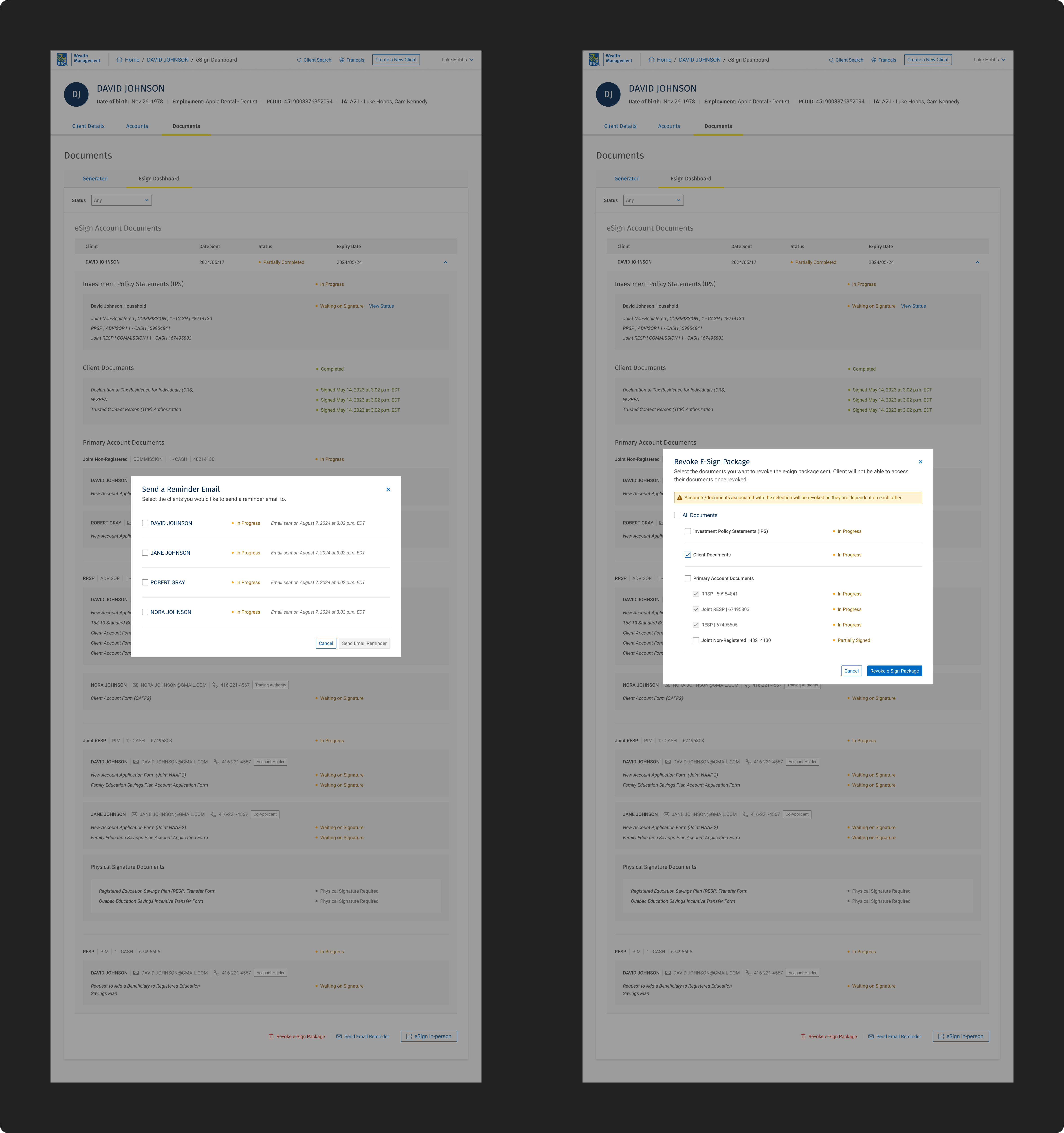
  • eSign Dashboard: The post-send status tracker for monitoring signature completion.

Validation: Synthesizing Signals into a Strategic Roadmap
Usability testing with 5 RBC Wealth Management associates was conducted to validate our core hypotheses. The results provided strong quantitative validation and crucial qualitative insights for iteration.

The Validation: Proving the Core Concept

The Nuance: Uncovering Critical Iterations
The feedback revealed specific, high-impact areas for refinement that were crucial to the experience.
  • Signer Management Microcopy: 3 of 5 users struggled with the language in modals and CTAs, indicating a need for clearer, more contextual messaging.

  • Navigation & Context: Users desired documents expanded by default for a better overview and clearer status indicators on greyed-out items.

  • The "Download Draft" Request: Emerged as a strong user need for offline verification, a feature we had deliberately scoped out of the MVP.

From Insights to Action: Strategic Prioritization
The usability findings provided a clear direction for iteration.

To ensure we built the most impactful solution first, I facilitated a prioritization workshop with product and engineering leads.

We mapped all findings on a standard Impact/Effort matrix to create a shared, objective framework for decision-making.
  • Quick Wins (High Impact, Low Effort): Fix confusing product copy on modals, set documents to expanded view by default, update notification types from 'warning' to 'info'.

  • Major Initiatives (High Impact, High Effort): Develop the "Download Draft" functionality, redesign the post-send dashboard navigation to a consolidated household view.

  • Low Priority (Low Impact): Minor visual tweaks and copy changes.

The Final Design: A Validated, Household Centric Flow

The finalized high-fidelity prototypes incorporated the prioritized "Quick Win" refinements and embodied the core architectural decisions.

Each screen was designed to validate our initial hypotheses and resolve the key pain points of the original workflow.

1. Unified Document Management Dashboard
  • Hypothesis Validated: A single-page system reduces errors and improves efficiency.

  • Design Rationale: This hub consolidates all client and account documents for the entire household. Based on testing feedback, documents are expanded by default to provide immediate visibility and context, eliminating the need for manual discovery.

  • Annotation Example:

    1. Expanded by Default: Based on user testing, all documents are initially expanded to provide associates with immediate context and reduce cognitive load.

2. Streamlined Signer Management Flow
  • Hypothesis Validated: Flexible signer management accommodates complex households.

  • Design Rationale: The process for adding beneficiaries and co-signers is integrated into the main flow via a clear modal, maintaining task continuity. Microcopy and CTA language were refined post-testing to eliminate ambiguity.

  • Annotation Example:

    2. Contextual Modal: Signer management is embedded to prevent context-switching. Copy was simplified from 'Send Document' to 'Add Signer' to reduce anxiety.

3. Pre-Send Validation & Review State
  • Hypothesis Validated: A consolidated system reduces frustration and errors.

  • Design Rationale: This mandatory review step acts as a final "quality gate," providing a comprehensive overview of the entire household package.

    Built-in validation logic ensures all required signatures are assigned before sending, directly preventing the errors that caused onboarding delays

  • Annotation Example:

    3. Quality Gate Check: A final review state with validation logic to ensure package completeness, preventing rejection and rework.

4. The eSign Dashboard (Post-Send)
  • Hypothesis Validated: A consolidated system reduces frustration and errors.

  • Design Rationale: This dashboard provides a transparent, real-time status tracker for every document and every member of the household.

    The design balances familiarity with the existing system with the new need to view status by household, a key insight from testing.

  • Annotation Example:

    4. Household Status View: Provides a single source of truth for the signing status of all household members, moving beyond individual account views.

Outcome: De-risking Investment and Influencing Strategy
This project delivered its primary value by de-risking a significant product investment and establishing a new architectural standard for complex financial workflows within RBC WM.
Key Outcomes & Strategic Impact:
  • De-risked Product Investment:
    The project is a validated asset on the 2026 roadmap. We delivered a user-validated blueprint and a prioritized backlog, substantially reducing the uncertainty and overhead for future development.
  • Strategic Architectural Influence:
    The "household as a unit" mental model I introduced is now actively being evaluated as a new standard for other onboarding and service workflows, demonstrating systems-level impact beyond the initial scope.
  • Quantified Metrics (Anticipated Impact):
    Based on task-time metrics from usability sessions, we forecast a 40% reduction in manual processing time per onboarding case upon implementation.
This initiative highlighted the role of design in not just solving user problems, but in building business confidence and shaping long-term product strategy. The validated designs are prepared for implementation to deliver immediate ROI.