Food Banks Canada

Project Type

Information Architecture Project <> INF 2170 H

Team

Cameron, Cherry, Christina, Samarath

Role

User Research, Card Sort Study, Tree Test Study

Tools

Optimal Workshop, Onpoint Content Auditor, Balsamiq, Google Forms

Timeline

June - August, 2020
(10 weeks)

Background

Context

Food Banks Canada is a charitable organization founded in 1987 and one of the oldest food bank communities in Canada. The organization has been successful in raising donations through individual donors, corporate donations and many fundraising events with an annual revenue of 36 million dollars (2017). Their vision as an organization is to enable an effective food bank community that addresses the short term need for food and longer-term solutions to reduce hunger in Canada.

Current Image of Food Banks Canda Website - Homepage

Problem

After a preliminary research and walkthrough over the website we found many defective navigational menus and redundant user experience elements. People who are in desperate need for help from food banks can have a serious impact because of the IA of the website potentially affecting the community network of food banks throughout Canada.

Objective

We strongly believe that having an effective information architecture with continuous analysis and feedback can improve the user experience needs of the website. This project can be critical during this unprecedented COVID - 19 global pandemic, impacting millions of residents living across Canada helping them with essential food supplies and access to more food banks.

Research

Content Audit

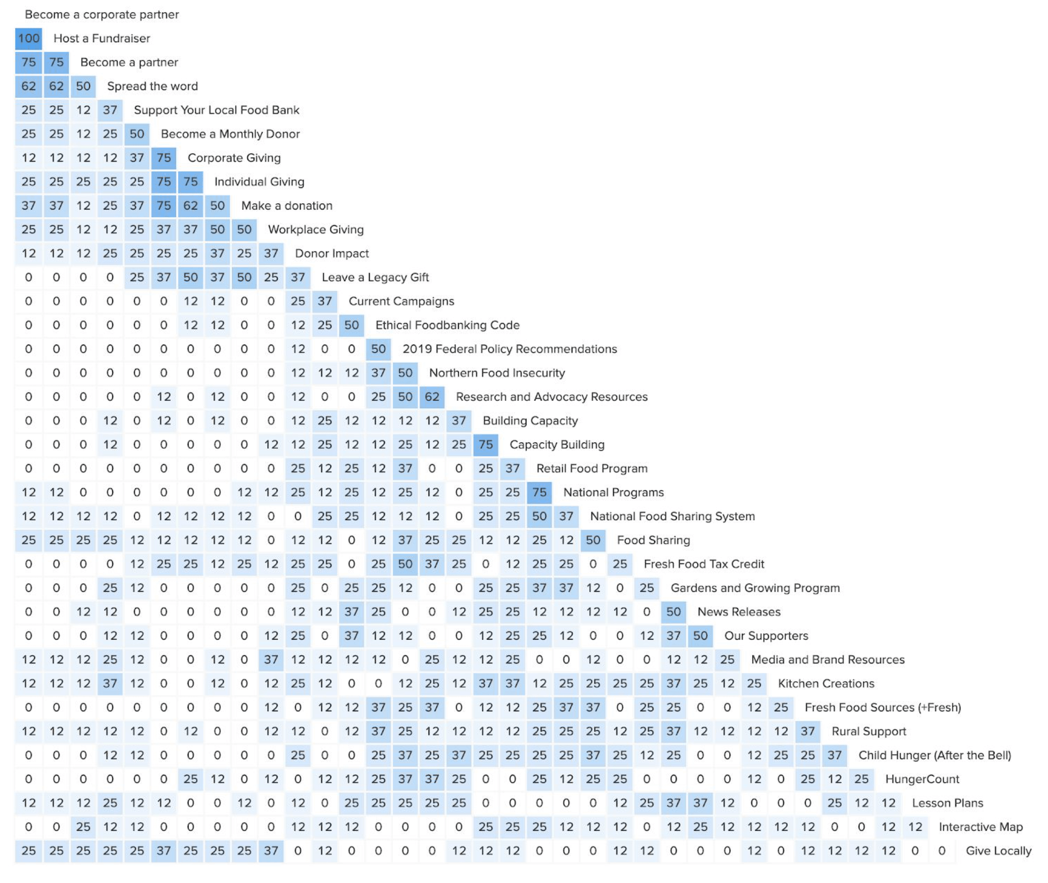
For the analysis of the website I started with a content audit. I used OnPoint Suite’s content auditor tool to perform our research, the auditor scraped through 100 pages on the Food Banks Canada website to determine content experience, search engine optimization, media, and the website’s responsive readiness.

Major Findings

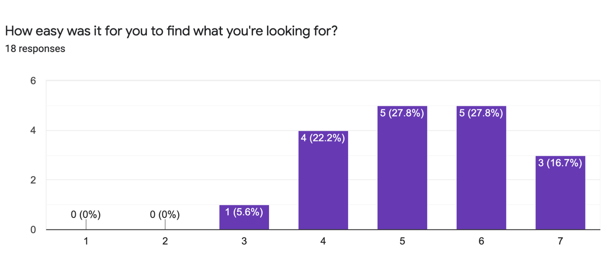
The Flesch-Kincaid scale measures reading ease on a scale from 0 – 100, where 60 – 70 is a recommended range.

The website received a rating of 42.6

Reading grade
of
12.8.

Average reading time on each page was 6.5 minutes

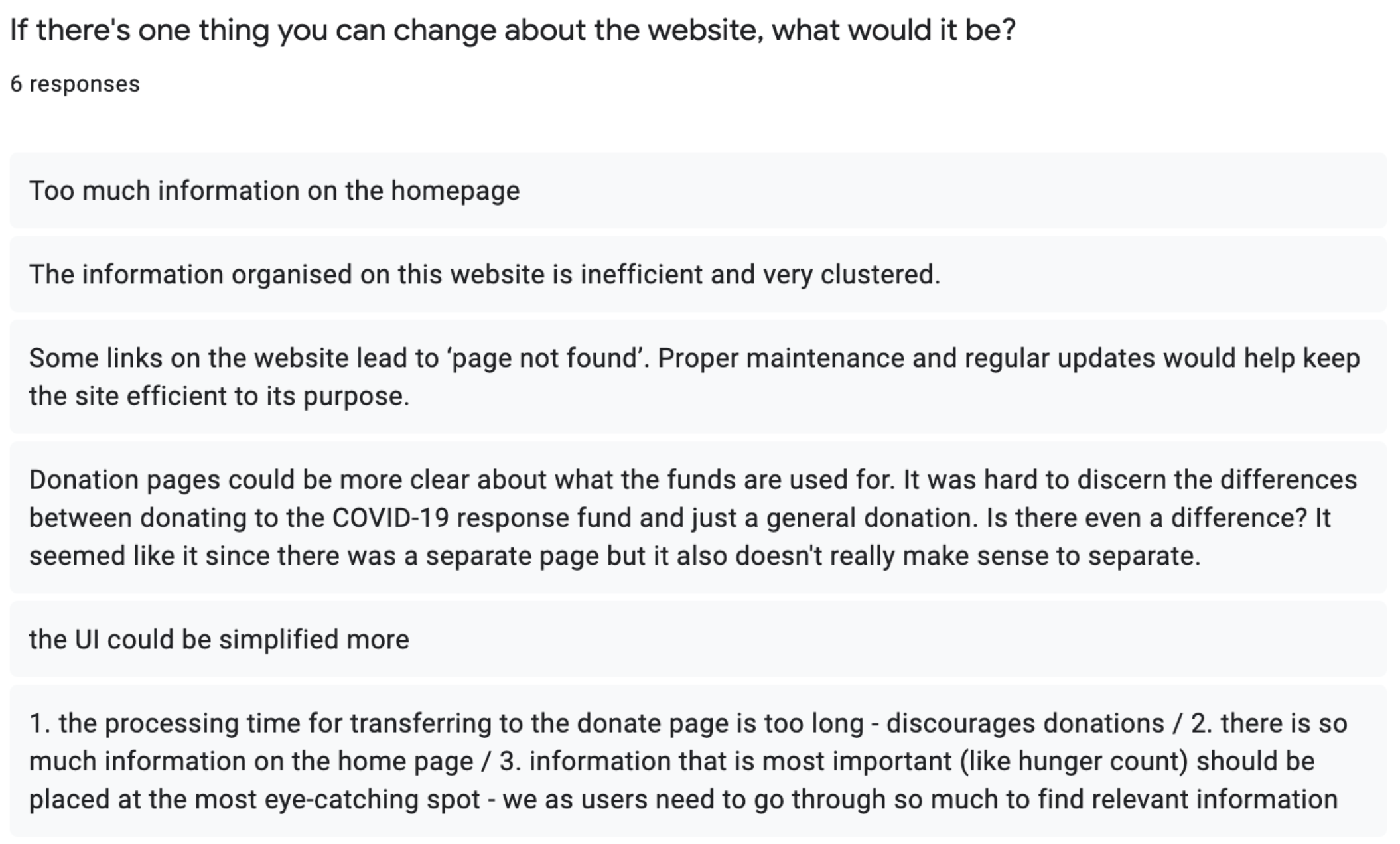
In total, the audited pages contained 165 images, mostly in JPEG format, and 63 of those images had missing alt text. Basically, 38% of all images present on the website had no description and hence would not be described to users that require accessibility services.

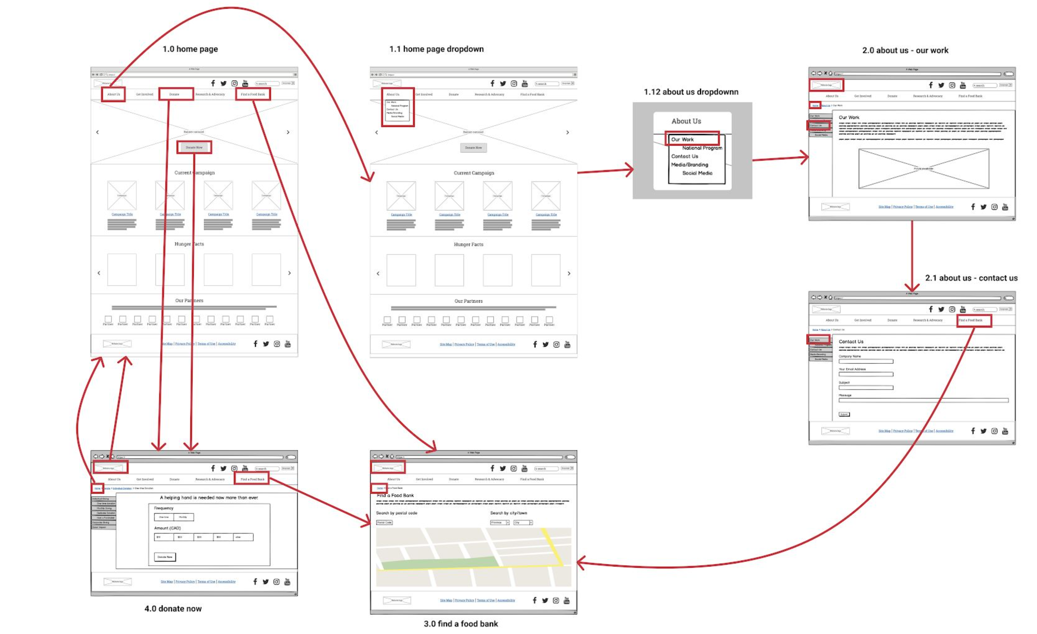
Current IA Schematic

We then represented the schematic diagram of the current IA of the website to understand the organizational, labelling and navigation system.

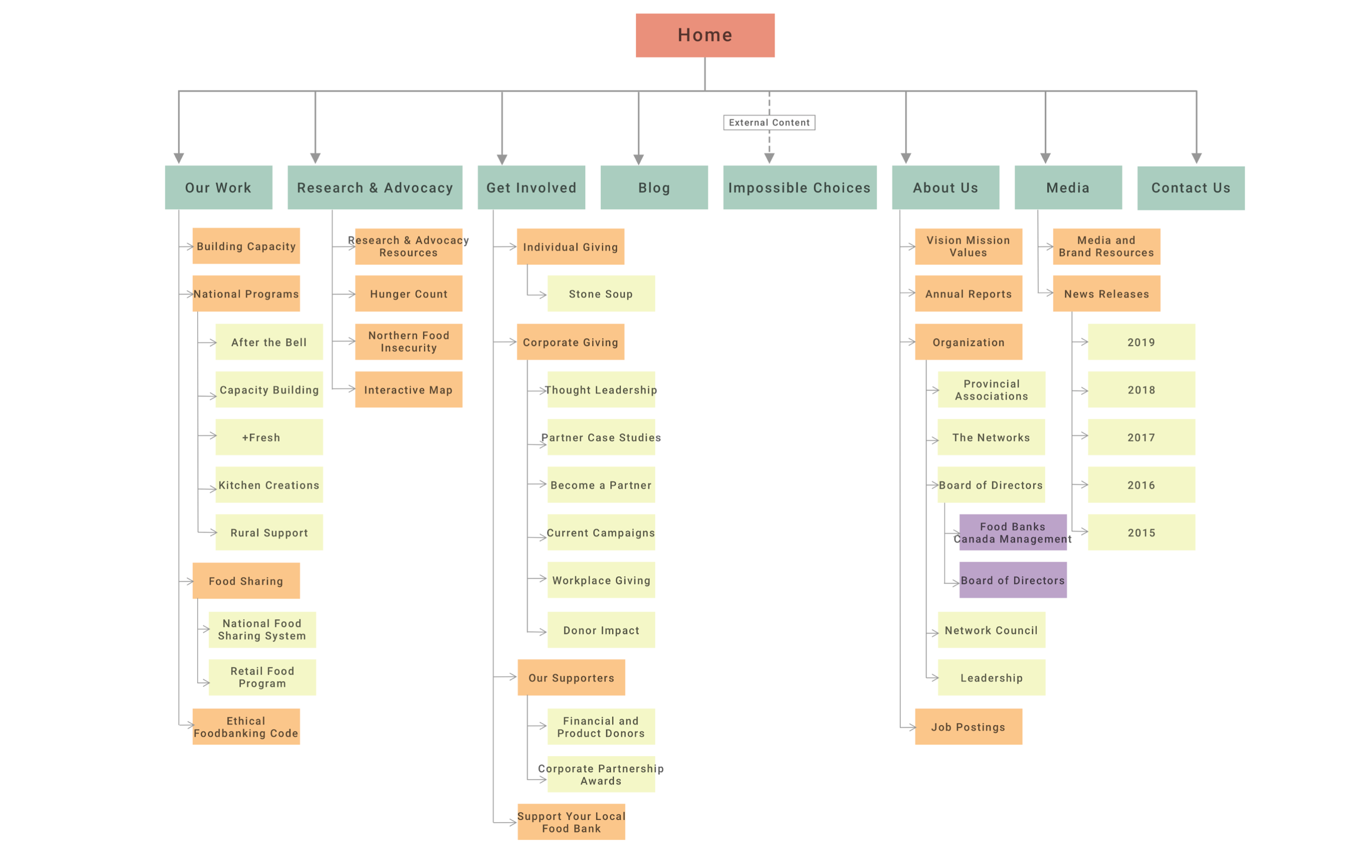
Organizational System

The complete organization system was assessed on two aspects: Does it support casual browsing, and does it support directed searching. The global navigation menu revealed an ambiguous organizational scheme which actually works well to facilitate associative learning.

Labelling System

Headings are used throughout the website to delineate content further into categories that are consistent with the labels that are used. However, there are some pages with missing H1 titles. This is consistent with the content auditor results.

Navigational System

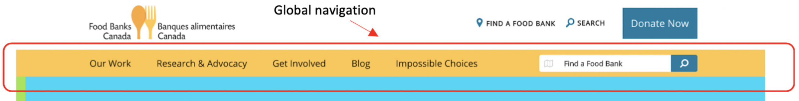
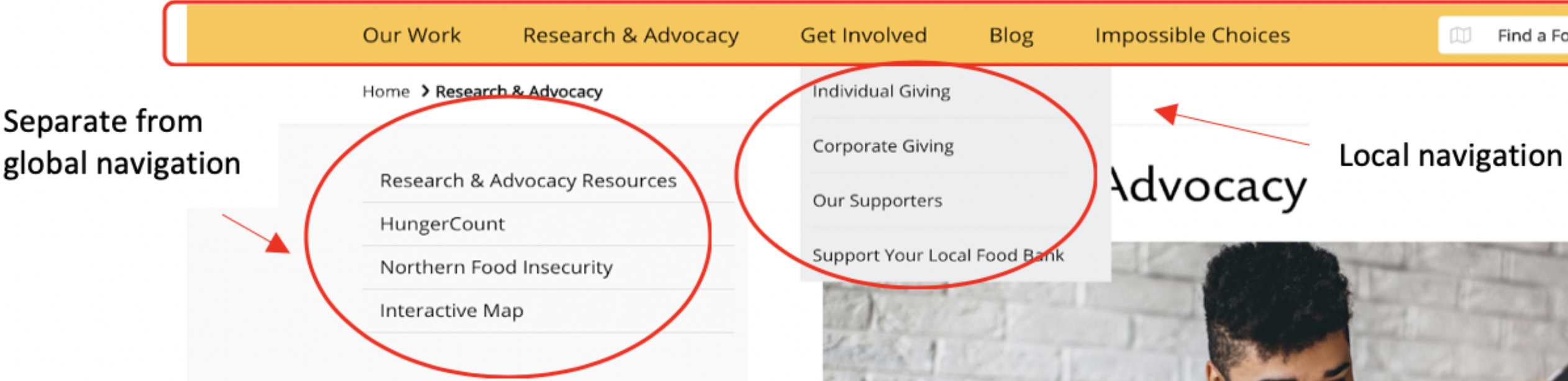
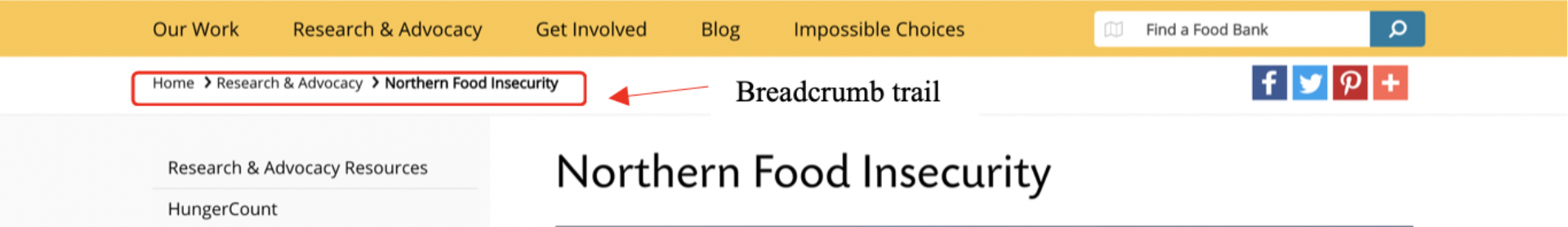
The website makes proper use of a global navigation system. Instead of blending in with the rest of the content it stands out, with yellow border fills, making it easier to locate right away. There are navigational aids such as breadcrumbs present to assist users along their search for information.
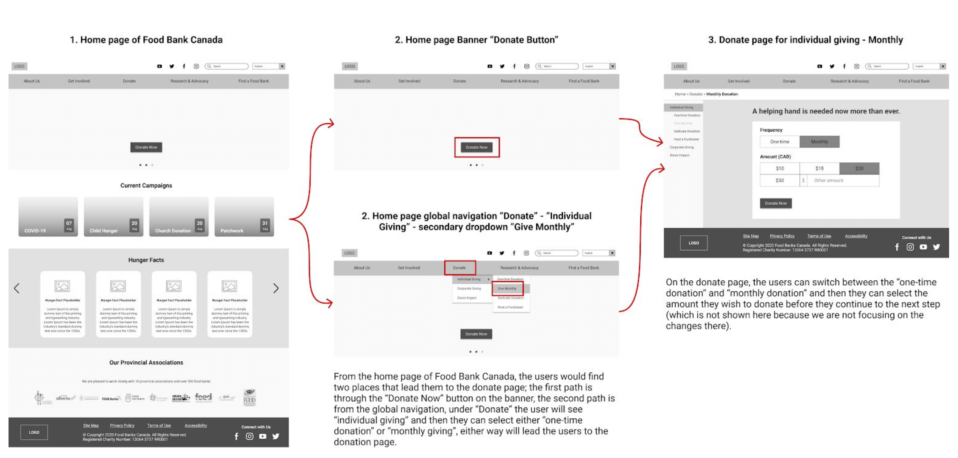
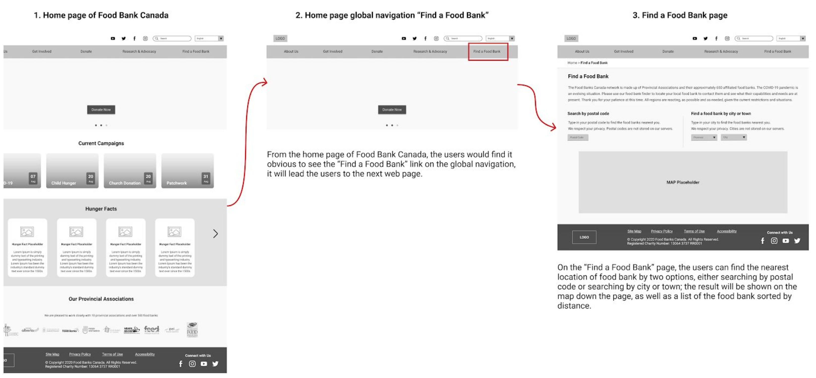
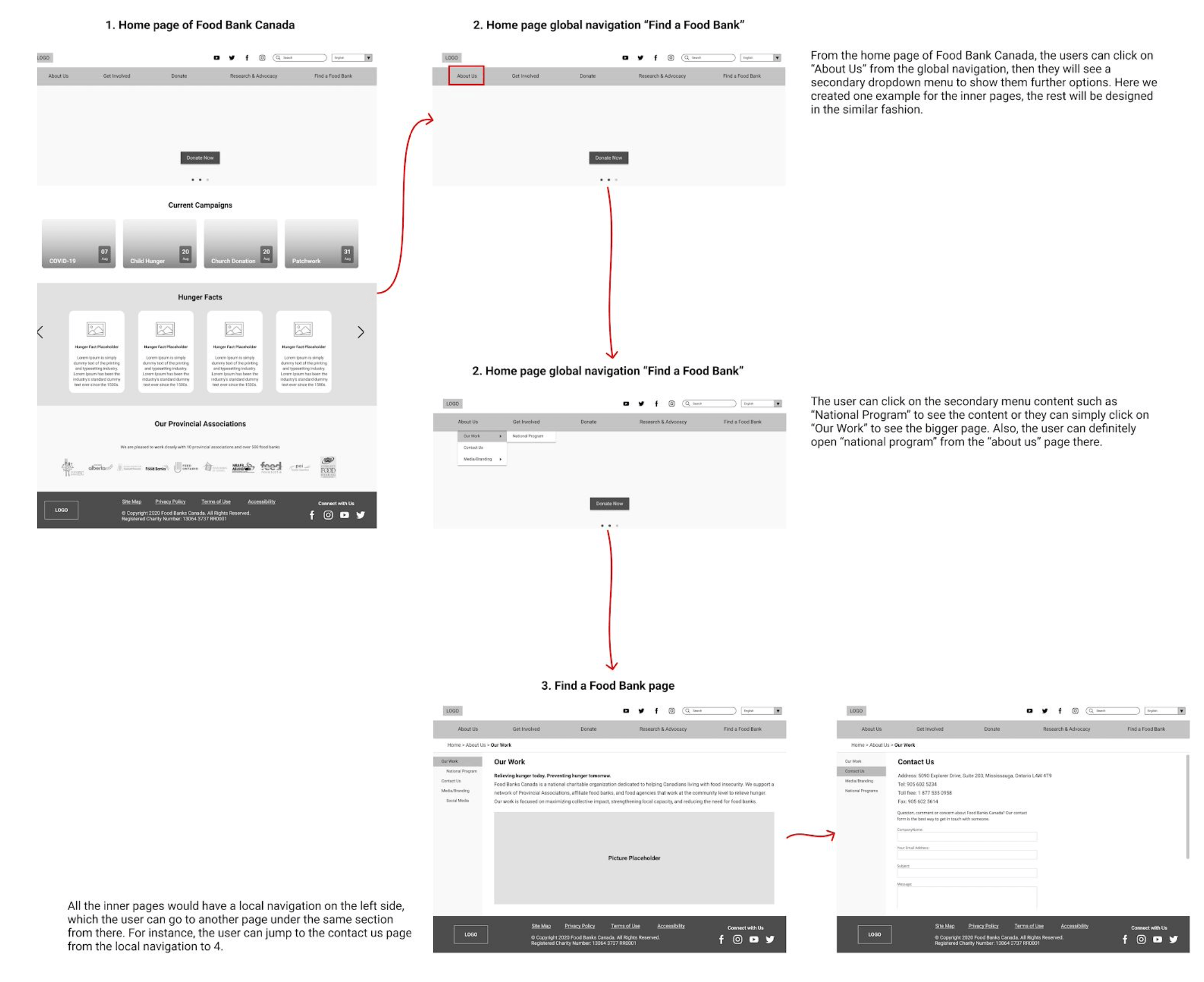
Analyze

User Research

To understand user impression and interactions with the website we used two research methods: Surveys and Usability tests.

Surveys

Out of the 25 responses I collected, only 14 responded that the website provided relevant information users were looking for and a majority of users voted the website architecture an average score of 5 when asked about their web experience rating. The feedback echoed this with participants complaining about the overflow of information and cluttered interface.

Here's the complete survey link and some of our survey results below

Usability Tests

The second method that we used to understand the users’ interaction with Food Bank Canada’s website was moderated remote usability testing. We followed Guerilla usability testing guidelines and the participants were asked to follow a think-aloud protocol. Three participants were selected to represent the website users to perform the tasks and complete the post-testing interview questions.

Find the hunger fact of the percentage of fresh food distributed by Canadian food banks.

 0/3 participants could successfully find out the answer.

Make an individual donation to COVID-19 campaign.

The second task was completed by 3/3 participants, because the donate button was prominent enough on the top of the homepage

Make a corporate donation.

The third task had most issues. Even though 3/3 participants could complete the task in the end, they had encountered difficulties during the process.

Find out the nearest food bank location (to the users).

Finding the nearest food bank location was easy to complete, and users spent the least amount of time on this task.

Intial Findings

  • As of now, the website is sufficient but not optimal for the majority of the tasks’ its users perform. Our research concludes a variety of redundant and ambiguous elements that contribute to the ineffective browsing experience. The content audit results also demonstrate that the website has a high reading grade.
  • Another important observation is the skewing of content towards the donor networks and donor related tasks. Search bar usage was very minimal and was not used by most users also those who used the search section felt the results were not an exact match for what they were looking for on the website.
  • The most critical observation is the site's nested and cluttered information architecture.

Ideate

Scope

From the feedback received from the analysis we wanted to identify solutions for the improvement of the overall IA.

Card Sort Study

I conducted a card sort study to address the question of

“How might users expect labels and content to be grouped together on the Food banks Canada website?”.

The purpose of the card sort is to have participants sort cards that represent the navigation labels of Food Banks Canada’s website and categorize the card labels that make sense to them.

The below similarity matrix summarises the way different labels were grouped by the participants.

Results I received from our participants was wide spread, reflecting a lack of identifiable association between the labels for website users.

From a total of 36 cards, 14 were sorted into 4 different categories by the participants;
7 cards were sorted into 5 different categories; and 2 cards were sorted into 6 different categories. Additionally, 12 cards from all participants’ results were sorted into the “Not Sure” category.

Only the card “Research & Advocacy Resources” was placed unanimously and correctly by all our participants under the “Research & Advocacy” category, which suggests that the use of similar or highly associative words can help users make intuitive connection judgements and reduce mismatched anticipation during navigation.

Preliminary Changes

  • The most critical change would be to unify some of the existing global navigation menu options with the contextual menu. This will help in eliminating the duplicate labels and reducing the overwhelming information.
  • Along with unifying labels we needed to improve the labelling system of the website to make it more accessible and increase the overall reading grade.
  • Food Bank initiatives and campaigns that are organized by Food Banks Canada can create confusion amongst users if they are not aware of them, but to maintain authenticity and uniqueness we recommend keeping their original names to better contextualize them but also provide a short description below each label with a campaign name tag.

Preliminary IA Schematic

Preliminary Wireframes

Test

Tree Testing

Before moving towards prototyping the changes ideated and sketched I conducted a tree test study to analyze how easily users can find information on our website and the places on the website where people lose track. I used these results to reiterate our global navigation, labelling and organizational system throughout the website.

I conducted the tree test analysis with 12 participants from diverse backgrounds with a common goal of making a contribution/donation to Food Banks Canada. Each participant was given 7 tasks with no time constraints and asked to locate the appropriate labels based on those tasks.

Tree Test Conclusions

  • Tasks where users had to backtrack multiple times had repetitive and confusing names which made us redesign our labelling systems better for multiple sections including global navigation of the current website.
  • Tasks with highest failures made us realize that key components of the user journey that were buried deep inside the navigational systems had to be resurfaced to a higher level for better task completion.

Final IA Schematic

From our observations and analysis of both card sorting and tree testing we finalized on the final
schmematic IA for Food Banks Canada.

Prototype

Medium Fidelity Prototype

We created a final medium fidelity clickable prototype from our ideation and usability testing.

Scenario 1 : Make a donation workflow

Scenario 2: Find a food bank

Scenario 3: Inner Pages Workflow

Next Steps

From the clickable prototypes created we would be interested in conducing a usability test with a sample size of users. Due to the current COVID restrictions we had a difficult time with regards to user research and testing throughout the project. We would be glad to continue this iterative process once things go back to normal and use the feedback to make design changes further.

Reflection

Learnings

  • During the process of dissecting a medium-sized website, examining its information architecture, and understanding information interactions along with organizational structures helped me deepen my understanding on the importance of a good IA.
  • Knowing what works and what does not for a seamless flow of information, and user experience is vital in the current digital world we live in. The skills I learned in the process of this project will be transferable to many other digital realms of information and the way it is presented to users.
  • From this extensive case study a personal takeaway of mine was the prioroty an IA occupies in the overall user experience for any product . Focussing on the product without structuring the IA can have significant effect over overall user engagement and acquisition.

Next Project - Interaction Design using Protopie

Project DetailsBackgroundResearchAnalyzeIdeateTestPrototypeReflection